Statement of Intent
Through the theme of Texture, I am aiming to create a high standard set of images, demonstrating my wide range of skills. I believe this theme would be a creative outlet to showcase my creativity and express the beauty of the texture of natural objects, such as trees, shells, and various fruits. With this theme, I can see the numerous perspectives on a simple yet alluring subject. It will allow me to communicate my knowledge of cameras, angles and research thoroughly. Using this project of textures, many concepts are offered on how to engage the theme with individuality. There are many textures to capture, such as man-made textures, natural textures, and up-close images, all through photoshop refinery, but I have decided to show a more natural side to my work. To accomplish that I will take photographs at sites such as the Peak District and Padley Gorge.
As a starting point for my research, I will look at texture photographers. For example, I will use Pinterest to check out their work and try to incorporate it into mine. I have recently come across the modern contemporary artist Nik Merlov, who uses nail polish in his work and oil, to capture different textures. It also brings to mind the experience of going to galleries and experiencing photography and the theme of texture from various perspectives, and how the artists express their skills. Having been intrigued by Edward Weston's photographs, I wanted to find out more about his work. I uncovered a wide range of images that conveyed his keen understanding of how to take photos that caught your eye and captured the texture of fruits, flowers and vegetables by the way he lit the images, and will continue to inspire my own work. One more photographer is Aaron Sikind, who works with ropes, sand, and seaweed to create his compelling images. His concept is all about texture, which he shows by shooting on a local beach and capturing natural textures. As a result, I have been inspired to explore natural and man-made textures in my area and realize that I do not have to travel far to create captivating images.
Creating an easy way to organize all my ideas will help me build a broad mindset, allowing me to plan my photoshoots and locations accordingly, resulting in high-quality photographs. Additionally, I will put together images to influence my later work in this project by using a tool called Coggle, where I believe I will be able to create and link ideas for this project, for example man- made textures and natural textures. The use of mood boards is yet another significant method of expressing what I want to show in my photographs. That way, I can look at images that inspire me, and add more during the project. Moreover, I have taken into consideration researching photographers whose images are based on my theme of textures to learn what they are doing to achieve such high quality images and what I should be doing to accomplish creating pleasing images. Additionally, I will learn how to use a camera skillfully. That would be valuable since I will gain a better understanding of what I need to know to take good pictures. For example, I will learn some "camera tricks'' in class. Given the tools I would have, I can go to the school photography website where I could view the past student work. This would enable me to find out what they did to achieve their grade.
I am hoping to conduct a wide range of photoshoots, showing the two sides of texture. For example, going to a natural setting, Padley Gorge, and contrasting this with an industrial site, London, would allow me to show the two sides of texture. (Natural and man-made). Also, I would make use of the tools that would be available to me at school, such as shooting fruits in the classroom. I would also make sure to go to Salford quays, where I would be able to snap photos of the rippling water. I also intend to go outside. Additionally, I could acquire appealing images of the Moors in the Peak District that demonstrate and display the natural side of this theme texture.
The first thing I will do is experiment with the resources the school provides me, for example, a manual Canon DSLR which I will use to create photos that are more detailed. I may also experiment with photography outside of school with a phone camera. I will also receive training in photoshop, including how to change the layers, create shadows, edit unwanted inanimate objects, and use lighting to make them appear more aesthetically pleasing. To get an understanding of what setting most appeals to me, I could go to a variety of places to see which gives me the best results in my photographs, for example, I could go to the Peak District, London, and Padley Gorge. To get an understanding of what setting most appeals to me, I could go to a variety of places to see which gives me the best results in my photographs, for example, I could go to the Peak District, London, and Padley Gorge.
I aim to spend around 4 months on this theme, this way I will time to learn about not only this topic but with what I feel comfortable doing within this branch of photography. The progress tracker will also allow me to note my feedback and grade for graded assessments. I will also develop ideas in photopea, then refine and focus on one particular area. Finally, I will designate specific folders to allow me to stay organized. Additionally, it might be worthwhile to put specific images in a folder corresponding to the photoshoot. For example, all the Padley Gorge images would be placed in the same folder. My homework relating to this theme will also be published on this website. For instance, I could start off with the ABC project and find the alphabet in natural textures.
My goal is to increase my knowledge of camera skills (changing the IOS, lenses), and to gain exposure to locations I might not ordinarily go to photographically. Similarly, I am going to reach out to my teachers and peers for a second opinion on my work, this will enable me to develop a growth mindset. Upon completion of this project, I will conduct an evaluation on the entire project in an effort to identify areas for improvement for future projects. I will also utilize PowerPoints and other resources to help me grow and find explanations for tasks I may not understand.
Edward Weston Research
Composition
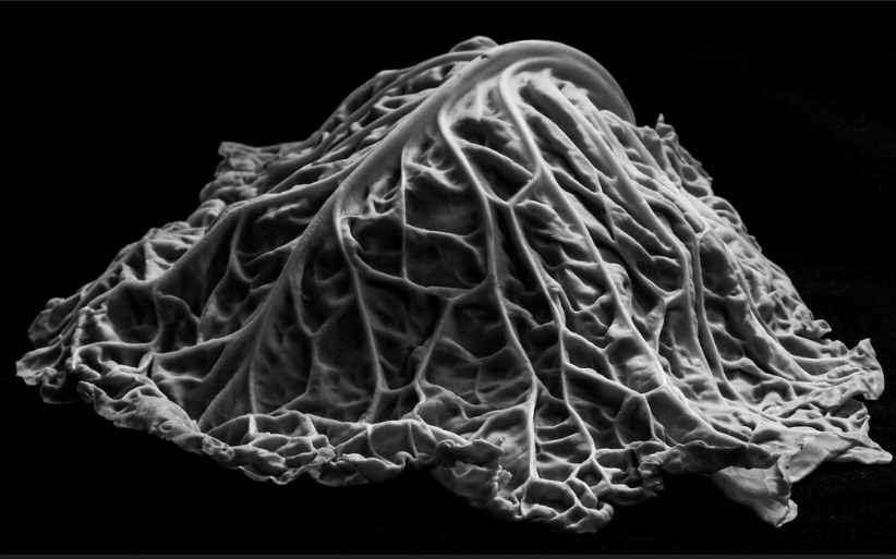
Edward Weston, in my opinion, has cleverly used black and white to his advantage because it makes the image have more of a dramatic effect and the bulk of the cabbage really projected out to you. He has also used soft, subtle lighting from the bottom right to give it that 3d form which makes the texture and shape stand out more, especially with the black background . The black background has been neatly used, and I cannot see any lines or corners which suggests he may have used an infinity curve. Edwards background has a shallow depth of field, because it doesn't proceed on. I also feel like this could have been a studio shot as we cant see any reasons to suggest it had been taken outside, Weston may have used a tripod because cameras in the 1900s were most likely to have a slow shutter speed and they were quite substantial. During the 1900s, cameras weren't that advanced so Weston's ISO and white balance would have been set manually. Edward did not use the rule of three thirds, however it looks like he was trying to achieve a sort of a symmetry look, which I think he has attained. The photographer has cropped the image, most likely because it attracts your eyes to the cabbage rather than the background which then makes you focus on the texture, and the level of detail on the cabbage. This image also looks like it had been taken from eye level which gives a feeling that you could reach out and touch it. In my opinion, my eye is more attracted to the middle because of the emphasis of the shadows around that particular area and the leading lines of the cabbage leaf. My eyes follow it around like a map, which is really interesting and really captures and pulls you in to look and take the image in more. Another clever technique Weston has used to his advantage, is the lighting in this image many forms of lighting could of been used however, Weston has chosen at the bottom right because it gives the image a 3d shape format look which makes the whole image real.
Context
Edward Weston was born in America, Illinois. Weston then moved to California where he opened a portrait studio in Los Angles. Edward is most famous for his landscape pictures, vegetables as shown in the cabbage picture. Weston mainly focused on the nature, for example people, rock dunes and outside. I feel like this makes his image more intricate and you can really connect with his image as it is in our nature as human beings to be more attracted to that sort of stuff. His images also really reflect the 21st century and how we do our images today. His images are still bought today.
Source- https://www.westongallery.com/original-works-by/edward-weston
Source- https://www.westongallery.com/original-works-by/edward-weston
Connection
A connection between Weston's work is texture. You can see he's really focused on the texture so the whole theme could have been texture, and that was Edwards main point in this picture. This work also links into my component 1, where you focus on texture of vegetables, for example oranges and cabbages as Edward has done. I also feel like it could be linked to lighting as he has really played on the lighting in this image, which I have tried to with pictures of flowers and really trying to get the best lighting. I would definitely use this research to my advantage and take in consideration of how I want people seeing my images to feel, questions for me to consider would be: Does it attract the eye to a certain place? Does it have a focal point? How would you position your lighting? I also really like the way Edward has considered the framing and how the eye is instantly attracted there. Perhaps in my future studio work, I could try using a tripod.
Comment
All together, I feel like this work of image really gets you looking at every detail that could be shown. It gets the eye to focus on every inch of detail. It pulls you in, everything about the image just pops out to you. In my opinion, this would be work Id be trying to aim for when doing texture projects like this. As mentioned before, I feel like this image could be linked with a map, because the lines of the cabbage all link up leading all over the cabbage which is really interesting to see. Over all, I really like this image and it is definitely work I look up to and hopefully can achieve.
Nik Merkulov Research
Composition
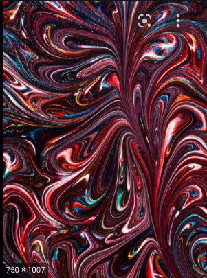
Nik Merkulov in my opinion has cleverly used his skills to his advantage to create his own textures using oil, paint and even nail varnish. He also captures his art in a clever way, using a light box which really makes the image stand out and give that bold effect. I feel like Merkulov has cropped his image, because you can't see any of the background, and this would make the viewer's eyes more attracted to the detail of the paint. I believe that this could be a studio shot because we cant see any reason to suggest it had been taken outside. This shot could have been taken as an above eye view to really capture all of the paint, which suggests he hasn't used a tripod to capture this image. He has used this to his advantage as it gives a feeling that it's like a mini galaxy and comforting to look at.
Merkulov mentioned using a minimal IOS to get the image to have some vibrancy to it, because this photographer is quite recent, I think his camera is advanced therefore not having a slow shutter speed, thus creating an image which isn't blurred. Merkulov hasn't used the rule of thirds, however if he was too, the image wouldn't have had the same effect of a “galaxy”. For me, my eye is attracted to the center, this for me is because of the patterns he has used and the brightness of that particular spot. I also feel like he has used this pattern to get the eye to follow the design.
Merkulov mentioned using a minimal IOS to get the image to have some vibrancy to it, because this photographer is quite recent, I think his camera is advanced therefore not having a slow shutter speed, thus creating an image which isn't blurred. Merkulov hasn't used the rule of thirds, however if he was too, the image wouldn't have had the same effect of a “galaxy”. For me, my eye is attracted to the center, this for me is because of the patterns he has used and the brightness of that particular spot. I also feel like he has used this pattern to get the eye to follow the design.
Connection
This links into component 1, texture. However this primarily focuses on the man made textures, using oil, paint and nail polish. In my project we have been focusing on vegetables and the texture of that. It also links to the camera settings and light to use for future projects. It also relates to modern day photography and what we use to create images like this and they all have some relation to each other. As you can see, the level of detail really links to texture and the patterns you can see.
Context
Nik Merkulov, a modern day photographer, first started out to be a painter, which later on became the sole of his photography. Using his artistic skills, he creates abstract, bold and colorful images, whilst retaining the knowledge of photography to give a quite pleasing image to the viewers. He uses the materials, oil, nail polish, brushes and water to create texture and patterns.
Comment
I really like this image, because it really reflects the work of other photographers today and what I would like to recreate. It has given me the idea to use paints, and oil in my work and really get creative rather than using natural stuff for the texture projects. As I mentioned before, it creates an image of a “galaxy”, and would definitely want to create a sort of story within my images, which the viewer could relate to or understand what I'm trying to put out in my work.
Research - Sandra Bartocha
Context
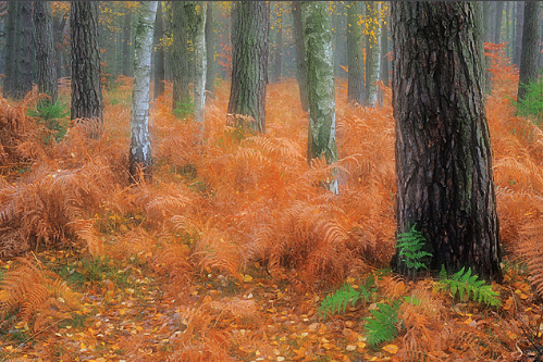
"Sandra Bortocha (1980) is a German freelance photographer and author specializing in natural landscapes, forests and plants as well as abstract work, with the specific aim of creating images that evoke an emotional response. The beauty of nature and natural light is a great source of inspiration to Sandra. The beauty of nature and the beauty of natural light is a great source of inspiration to Sandra. She tries to photograph nature in an artistic way rather than trying to document it, focusing on details, light, colors and moods and using creative camera techniques to capture the beauty of a scene in the best way. Her pictures have been published in European magazines, books and calendars, and she has received prizes in numerous international competitions –including the Wildlife Photographer of the Year and International Photography Awards. Sandra was vice-president of the Society of German Nature Photographers (GDT) from 2007 to 2013 and is chief editor of the magazine GDT Forum Naturfotografie. She was one of the photographic team on the pan-European Wild Wonders of Europe initiative. Currently, she is working on a long-term project about the north of Europe."
I have received this information from this website: https://mrjangear.com/sandra-bartocha/
I have received this information from this website: https://mrjangear.com/sandra-bartocha/
Composition
This is a landscape image consisting of a contrast between bright orange ferns and green ferns which create a splash of green through out the whole image. The trees, leaves and ferns act as a foreground for the image. Sandra as also really thought out the distance, because of the shallow depth of field, it allows us to see the little details of the leaves on the forest floor to the strong leading lines of the trees. Sandra has also thought about the rule of thirds making the dark tree to the right hand side of the image rather than the middle as this appears more pleasing to people viewing the image. Bortocha has also used the tools to her advantage by using photoshop and skillfully manipulating the exposure and layers to create a sort of mystical look, which makes a poetic essences among the image. It almost looks like an image out of a fairytale book. The lighting of this image is quite soft, and light which tells me that it could of been taken in the early morning or early evening as the lighting during these times are exhilarating. She has also used a tight crop, which makes me focus on the little details of the leaves among the floor. The angle is also straight forward which makes me seem like I could walk into the image, using this it is a great way to captivate her viewers. There is a vanishing point between the trees in the left hand corner, this makes your eyes follow the path of the tree, to see the vanishing point. As you look into the distance, you can see the color of grey which contrasts the orange of the ferns in the beginning and middle of the image. It also gives a great depth of field as you are desperate to know what's beyond the trees and what you may see after seeing this captivating place. The trees are a great quality of this image because it has very strong vertical leading lines, and the level of detail to the texture on the tree is truly alluring. By choosing to cut off the top of the trees makes the leaves on the tree, looking like they are falling gracefully. This also adds to the fairytale look to this ensnaring image of a clearing. The photograph seem fairly old as we cannot see any new technology however the camera seems very advanced to capture and change the ISO and white balance to create this image.
Content
Sandra Bortocha has chosen to take a landscape photograph and by using this technique it allows her to capture more than you would of in portrait, by doing so makes her views seem more included in the image as it makes it look like you could just walk in. Its a beautiful image of a clearing in an isolated, rural autumn wood. This image also looks sort of magical, it looks very tranquil, like a place someone would call home. It gives an essence of warmth, and in my opinion you can really feel it through the screen.
Comment
I enjoy viewing this image and I believe that it has many strengths in terms of the feeling it gives off, and I am very fond of the texture and representation of the woods in this captivating image. It has been captured so clearly that you can also most touch and feel the textures on the trees and leaves among the forest floor. The colours also contrast greatly as green and orange work very well together. Sandra has also sort of made this image very femininized and as a woman this image really speaks out to me. Overall everything in the image compliments each other really well creating a very captivating image. However, some people may perceive this image to be simple, but I believe that the simplicity is what makes it so breathtaking because you can really focus on that main focal point rather than loads of stuff happening and not knowing where to focus would create a feeling of chaos. This links to my project of texture because of the level of detail on the trees and leaves. It also links to my learning of vanishing points, composition and leading lines. I have also been to a place like this, Padley Gorge and this could inspire my images that I had taken at Padley Gorge to capture the beauty of the wood.
Mood Board- Natural


Mood Board- Manmade


Coggle Mindmap
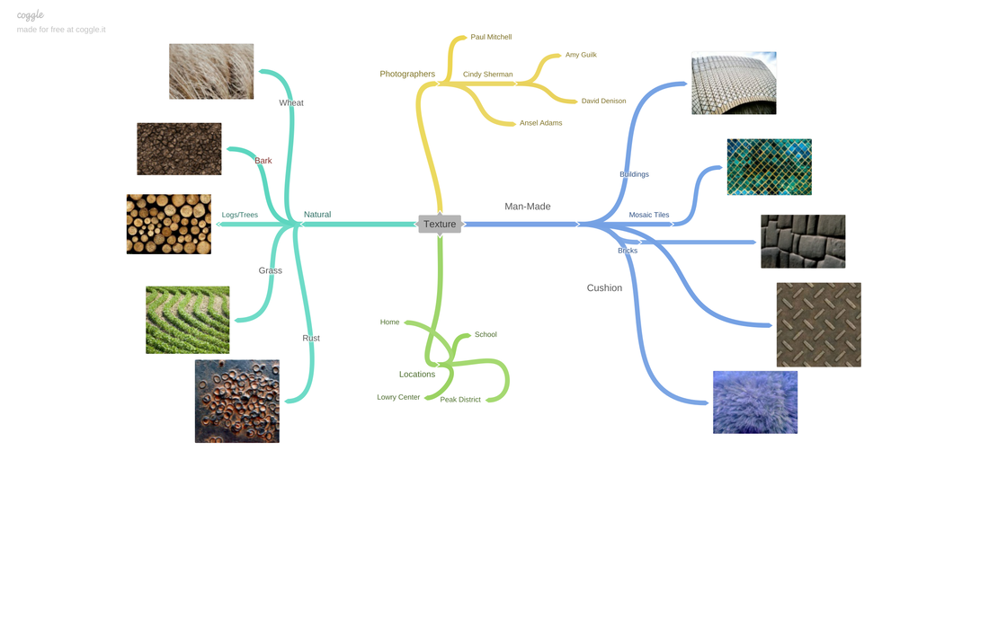
NATURAL
Oranges


My best and worst images:
|
In my opinion, I think this is my worse because of the first orange is blurred. I also think the proposition could have been better as half of an orange is not in the shot. The background also has a bit of water spilt and I think it could of been cleaner to make it a nicer shot.
|
I feel like this is my best image for the oranges because of the proposition and the lighting and how it brings out the texture of the orange. The background of the image is also blurred which I think makes the eyes more attracted to the detail on the orange.
|


During this photoshop, I opened the history window this allowed me to then delete any previous action I may not of liked. For this orange I changed the contrast of both the orange and background. This was my first time experimenting on photoshop. I also learned the tool of locking each layer and unlocking.
Kiwi


Red cabbages


My best and worst images:
|
I think that this is my best image because of the level of detail and the patterns of the red cabbage stands out. I also like the lighting and how its quite dim as I think it creates a dramatic affect.
|
In my opinion this is my worst image because of the camera angle and how you can see the background in the picture. I didn't turn the lens to make it a better quality. I also feel like the eye cant concentrate on one bit of the picture .
|
Broccoli


Sweetcorn


Peppers


This was before, I chose this image because of the background and how you could see the whole object. This was experimenting and no tutorial was used.
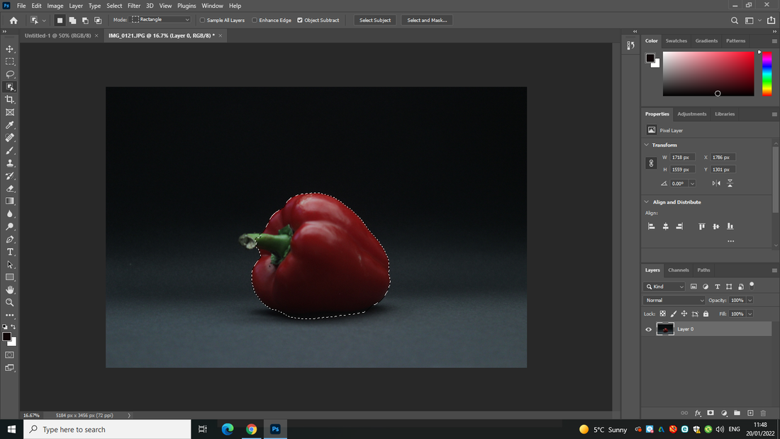
For this I selected the crop image to crop a certain part of the image, then I unlocked the layer.
|

I then duplicated the pepper and moved the pepper slightly upwards and changed the saturation, this made it seem like its coming out of it.
|

This was the final outcome, I am very pleased with it because it makes the viewers captivated and interested to see this pepper coming out of the pepper, it looks sort of delayed.
My best and worst images:I feel like this is my best image, because of the background and how the red in the pepper stands out. I also like the proposition of the pepper, the exposure and how it goes from dark to light. It gives a dramatic affect, because of the shadow of the fruit and the backdrop.
In my opinion, I believe that is my worst image because of how blurred the picture is. I also feel like I had zoomed in too much and didn't turn the lens to make it better quality. I could have had a better angle where the pepper is in the middle.
|
|
Apples


My best and worst images:

|
I feel like the first one is my best image because I love how the red stands out in the black background. I also love the detail of the apple and the quality of this image.
|
I feel like this is my worst image because the white balance was off and i didn't use the lens to get a better quality. You can also see the background which makes the image look a bit off putting.
|
Cabbages


My best and worst images:
|
In my opinion this is my best image because of the level of detail and the background. It makes the eye look into the details of the leaf. I also really like the quality of this image.
|
I feel like this is my worst image because of how much I zoomed into it and the quality of the image, it makes the eye not know where to looks so therefore not really paying much attention to the detail.
|
Mushrooms


My best and worst images:
|
I feel like this is my best image because of the dramatic affect it. It focuses on the texture of the mushroom, and I love how it attracts the eye because the other one is blurred out. I also like how I zoomed in which made it even better.
|
In my opinion, this is my worst image because of the white balance, it is a bit too much light. I also could of adjusted the lens to make it less blurry.
|
Tomatoes


Pineapples


My worst image:
|
|
In my opinion, the cabbage is my worst image, because of the white balance and the exposure, plus the lighting. You can also see a bit of the background, which makes the image look a bit off-putting. I also feel like the proposition isn't great, because a bit of the cabbage is not seen. I also went for an above picture without putting the right settings or zoom affect for it.
|

Flowers


|
For this, I cropped and scaled this image and pasted it four times, I then align them into a square and using the format options I flipped it horizontally and vertically, to create the kaleidoscope affect.
|


This was the final outcome, In my opinion I love this image because of the dark atmosphere it gives off. The rose has created a lovely pattern which is very appealing to the eye.
My best and worse images:

|
This is my best image because of the dramatic lighting and how the rose stands out. I love the angle and how you get the folds of the rose really clearly. I also love the level of detail.
|
In my opinion, this is my worst image because although the detail on other one is good, it doesn't focus on the other one as much which would of made the image look better.
|
Rose


My best and worst images:
|
I think that this is my best image, because of the focus on the rose and how much I could zoom in, I also like how it is in the water as it makes the image ten times better.
|
I feel like this is my worst image because of the background as you can see someone's hand and it makes the image look off-putting, I also don't like how you can see a splash of water on the vase.
|
Yellow Leaves


Best and Worst
|
I think that this is my best image because of the composition and the lighting and how it captures the autumn colored leaves as well as the trees and the lake and you can tell I have thought about composition.
|
I believe that this is my worst image because of how out of focus it is and I dislike the compositing and angling of the camera, I also should of put the ISO a bit lower to create a dramatic affect.
|
Green Leaves


Best and Worst
|
I believe that this is my best image because of the composition and how it focuses on the texture of the leaf. I also really like the dark dramatic affect it gives off.
|
I think that this is my worst image because of how out of focus it is which causes the shakiness, I also dislike the compositioning and angling of the camera. I should of zoomed more in to capture the leaves rather than the plain background
|
People


|
|
|
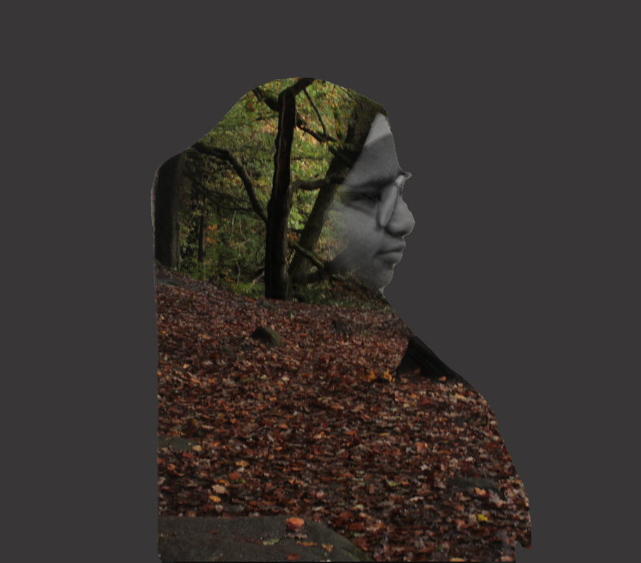
This was before I started the photoshop, in Padley Gorge, I chose this image to photoshop double exposure, because it really shows what your expression would be like seeing Padley Gorge therefore a clever way to show this.
|
For this effect, I used a tutorial on YouTube (https://www.youtube.com/watch?v=zMjl1HLxITE&t=583s).
For this, I cropped the image of the girl, and then proceed to add the chosen image, and place the opacity to 50%, and adjusted the image, using the brush tool set to the color black made the image inside the girl more visible. After that I made the girls face black and white using the brush tool set to white, this allows the viewer to see the expression of the girl. I then changed the background to fit the suited image inside the girl. |

|
This was my final outcome, I am really pleased with this outcome, because in my opinion its a clever way to show how you would feel seeing Padley Gorge. This development really helped me understand the brush tool and how to use it, and for future projects I would know how to do this again to get the desired outcome.
|
Best and Worst
|
I believe that this is my best image because it captures a wonderful natural reaction to seeing the wilderness. The trees in the background only add to it. I also like the composition and how it is tilted at an angle.
|
I think that this is my worst image because it is out of focus. Although the leaves are turned inwards pointing towards her, the focus and her not looking, makes it a bit off-putting.
|
Trees


Best and Worst
|
I believe that this is my best image, because of the composition and the lighting. It also makes it look something out of this world. The trees also create a nice pattern which attracts the eye.
|
I think that this is my worst image, because of how out of focus it is. The colors of the tree don't work well with autumn leaves. I should of lowered the white balance and IOS, to make a sort of dramatic affect.
|
Moss


Best and Worst
|
I think that is my best picture because of the lighting and the dramatic affect it gives off. However, the exposure could of been lighter to show the texture of the moss.
|
I believe that this is my worst picture because of how out of focus this is due to camera shake. Although, it captures the texture of the moss the composition could of been better.
|
Orange Color Theme


Best and worst images
|
I believe that this is my best image because of the orange theme color and the trees path lines. The rocks also add to its essence. I love the exposure and white balance which is demonstrated through this picture.
|
I believe this is my worst image because the exposure is too high. Although the image angle is good, the background sort of ruins the image as a whole because of the exposure. For future references, I should check the exposure before capturing the image.
|
Green Color Theme


Best and worst
|
I believe that this is my best image because of the dramatic affect it gives off. I also really like how the leaves are going inward towards the water almost making it as they are pointing towards there. Although I think i could of put the exposure up because you cant clearly see the water and this filter only looks fitted to the green leaves.
|
I think that this is my worst image, because of the angle I have took this photograph at and how the bridge is cut off and is in the image. I also feel like I could of put the exposure a bit lower to really get a dramatic look which is what I'm aiming for a "Dramatic forest floor look".
|
Dramatic Shots


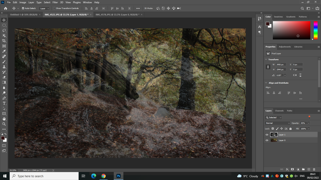
For this I selected two images I had taken at padley gorge and put the water one over the tree one, I did this to show the two sides of padley gorge in one image. I then changed the opacity on the water image to 45% so that you can see the tree image behind it.
|
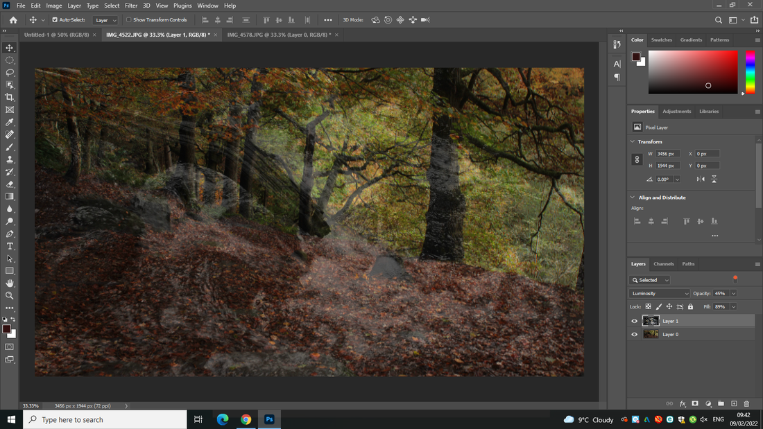
I then changed the fill to 83%, I then put the filter to Luminosity, which then changed the color's of the images and softness, this allowed the image to become more clear and soft to the eye.
|
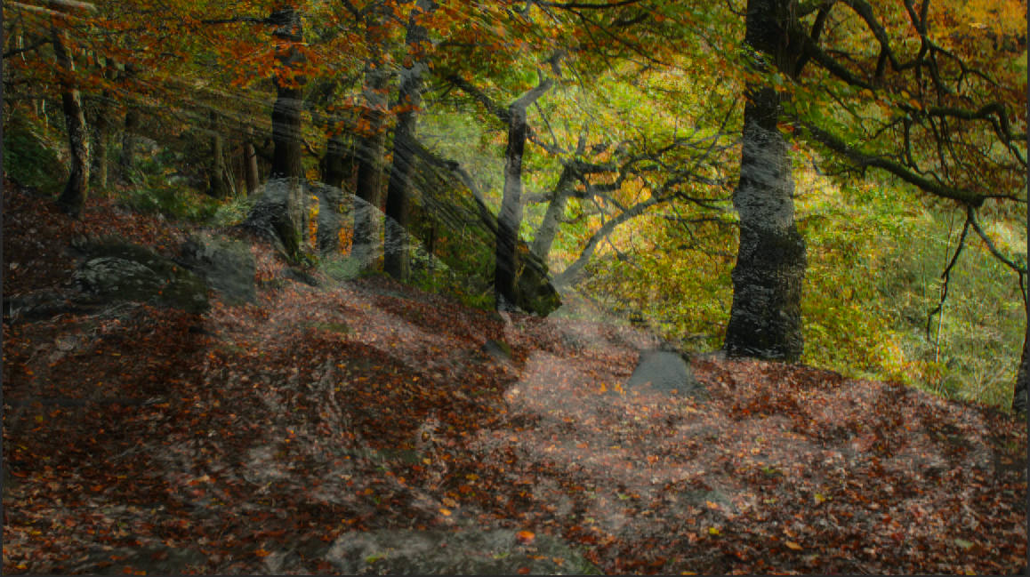
This was the final outcome to show the two sides of Padley gorge, I am really pleased with this outcome because it is a great way to show the two sides you would see at Padley gorge. However the lighting could be better in terms of brightness, it could be a bit dimmed down to look more softer, rather than harsh.
|
Best and Worst
|
I think that this is my best image because of the lighting on the forest floor and IOS of the camera and white balance it creates an essence of an actual forest floor picture due to the lighting factors and positioning. I also really love the colors, the green and orange it pops out at you.
|
I believe that this is my worst image because of the positioning and the how it is bent at an angle which doesn't look as appealing, at some parts of the image it looks blurry and it doesn't capture the water which was my aim for this particular image.
|
Leading bold lines


Berries


Rocks


Best and worst
|
I think that this is my best image because of how the orange and green leaves stand out against the dramatic dark background. I also used the sport mode to capture the moving water which equally adds to the picture making it my best image out of the rocks.
|
I believe that this is my worst image because of the positioning of my camera and how the rock isn't completely in the middle and the lighting of the rock and how you cant see the details on the rock, for example the moss.
|
Pops of Color


Best and Worst
|
I think that this is my best picture because it captures not only, the leaves but the water, grass and trees. It undoubtedly shows what Padley Gorge is about and what you would see there, because of this I like how it represents the place as a whole. I also like the techniques I have used like the white balance and IOS on this photo and how the colors really pop out at you.
|
I think that this is my worst photograph because of how shaky is is. I believe the shutter speed was slow and as I moved it captured the picture, although the colors stand out, the tress almost ruin it because of the dark coloring and I should of thought about what to include in the picture and the angles.
|
Trains


Tunnels


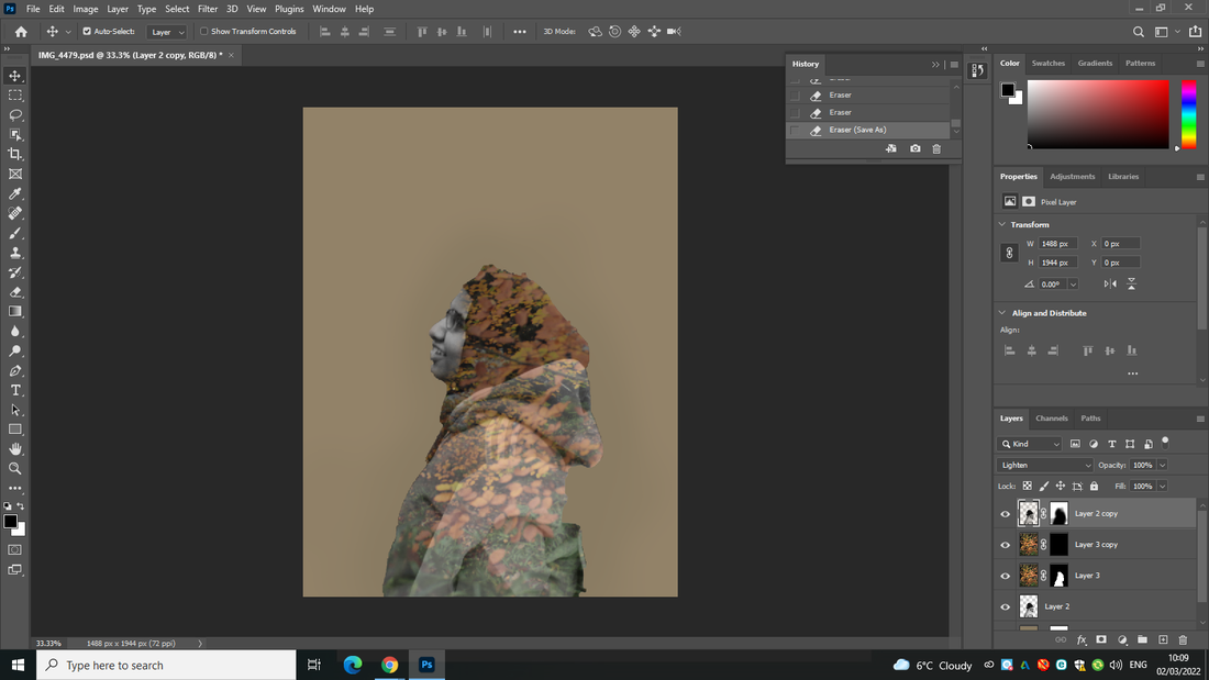
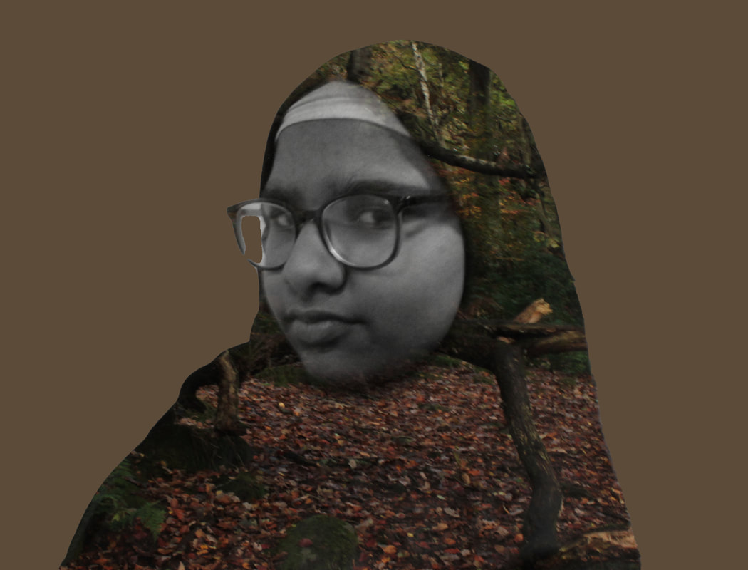
Upon this photo shoot, I discovered that I want to continue with the idea of double exposure as I have used this on a few of my pictures from this photoshoot so I will continue with this photoshop. I need more portraits
Modelling Photos


For this effect, I used a tutorial on YouTube (https://www.youtube.com/watch?v=zMjl1HLxITE&t=583s).
For this, I cropped the image of the girl, and then proceed to add the chosen image, and place the opacity to 50%, and adjusted the image, using the brush tool set to the color black made the image inside the girl more visible. After that I made the girls face black and white using the brush tool set to white, this allows the viewer to see the expression of the girl. I then changed the background to fit the suited image inside the girl.
For this, I cropped the image of the girl, and then proceed to add the chosen image, and place the opacity to 50%, and adjusted the image, using the brush tool set to the color black made the image inside the girl more visible. After that I made the girls face black and white using the brush tool set to white, this allows the viewer to see the expression of the girl. I then changed the background to fit the suited image inside the girl.
|
I really like how this image came out, because of the colors and how it perfectly fits with the image of the girl. I also really enjoyed creating this effect. This development really helped me understand the crop tool and how to use it, and for future projects I would know how to do this again to get the desired outcome.
|


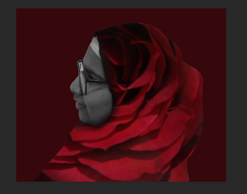
For this, I used quick selection of the model and duplicated it this when isolated the image of the girl from the background, I then desaturated the image, and placed my chosen image on top of the girl and changed opacity to 50% I then isolated the image of the back to go with the outline of the girl by duplicating it, I then used the brush tool to make the background image pop, I then outlined the girls face and then changed the background color.

This is the final image, I am overall happy with how it came out, however I think I should of created the face to be more of a shadow, and there is a hard line of the girls face so for next time I know I need to correct these errors to get the best image I can.


For this, I used quick selection of the model and duplicated it this when isolated the image of the girl from the background, I then desaturated the image, and placed my chosen image on top of the girl and changed opacity to 50% I then isolated the image of the back to go with the outline of the girl by duplicating it, I then used the brush tool to make the background image pop, I then outlined the girls face and then changed the background color.
I also used the tutorial: https://www.youtube.com/watch?v=zMjl1HLxITE&t=583s
I also used the tutorial: https://www.youtube.com/watch?v=zMjl1HLxITE&t=583s

This was the final outcome, I am sort of pleased with it, although I think I could of perfected it better, or chose an image to go in the background. The edges around her face could be more perfected rather than scratchy.


For this, I used quick selection of the model and duplicated it this when isolated the image of the girl from the background, I then desaturated the image, and placed my chosen image on top of the girl and changed opacity to 50% I then isolated the image of the back to go with the outline of the girl by duplicating it, I then used the brush tool to make the background image pop, I then outlined the girls face and then changed the background color.
I also used the tutorial: https://www.youtube.com/watch?v=zMjl1HLxITE&t=583s
I also used the tutorial: https://www.youtube.com/watch?v=zMjl1HLxITE&t=583s


MANMADE
Grater


Diamonds


Board Clips


My best and worst image:

|
This is my best image because of the level of detail on the image and the composition and lighting, it really captures the image as a whole, however the lighting could of been a bit lighter to show the more detail on the clips.
|
This is my worst image because you cant really see the clips properly, and I should of added a light source, and the composition should of been more angled and straight.
|
Nails


Best and worst
|
In my opinion this is my best image because of the positioning and how you can tell it coming out of a jar. I also love the way the metal stands out with the filter "turgent".
|
I feel like this is my worst image because of the positioning of the nails coming out of the jar. I also don't like the way you can see the refection of the celling through the jar.
|
Trumpets


Bottle of wine


Flowers


Best and worst images

|
This is my best image because, it captures the texture of the fake flower and isn't blurry . However the camera angling could of been better and I should of taken into account the rule of three thirds.
|
This is my worst image because, it is very blurry and the camera positioning isn't very appealing. The camera ISO wasn't set to fit this image so it gives an off putting look to it.
|
Chess pieces


Best and worst image
|
This is my worst image, because of the ISO and white balance and how its blurry. I should check the ISO and white balance and set according to the image.
|
This is my best image, because of how it focuses on that one chess piece and the rest is blurred out. So it brings your eyes to look at that chess piece. The background is also blurred which adds more to the image.
|
Metal wire


Best and worst images
|
This is my best image, because of the way the light reflects in one straight line. I also like the camera angle and the way it is positioned. The black background also adds to the image and makes it even more appealing to look at.
|
This is my worst image because of how blurry it is and the camera angle, however the ISO and white balance is perfect for this object. (Metal wire).
|
Chains


Best and worst Images
|
This is my best image because of the ISO and white balance which was set at turgent which really makes the chain stand out. I also really like the background and how it goes from light to dark.
|
This is my worst image because of how blurry it is and the camera angle and positioning of the chains. I also zoomed in to far without focusing in.
|
Diamond


Cogs


Sphere


Final Gallery

|
|

|

|

|

|


|

|
Final Evaluation
My main focus was textures, and I looked at a variety of them, including natural and man-made items. Leaves and flowers are two instances of natural textures, which I photographed in Padley Gorge, a place with a fascinating natural texture. The concept was appealing to me since it allowed me to photograph elements that I enjoy, such as building textures, flowers, and water. It allowed me to be more creative and explore the many various facets of photography as well as this particular topic texture. Setting up my own photoshoot with fruits and deciding on the lighting and positioning allowed me to think more deeply about how to achieve a beautiful picture was an example of me being creative. It also helped me to broaden my expertise in areas like photography. I learned how to operate the lens and white balance, as well as how to adjust the ISO.
In photography, I found photoshoots to be the most exciting since I enjoyed capturing pictures to utilize in my job and reviewing the images so that I could improve my skills. Using the camera to capture images that would otherwise be boring in real life and turning them into something exciting and captivating was a genuine thrill for me. I also enjoyed taking images with my peers, such as during a modelling photoshoot, when I particularly enjoyed photographing natural raw emotion, such as a natural smile. Learning how to use the camera on manual settings was particularly interesting to me because prior to photography courses, I had no idea how to use a camera and these sessions really helped me fill in the gaps in my knowledge.
Building a website was something completely new to me, so in these photography lessons I have learnt how to build a professional website and how to address it. I have also learnt how to use photoshop correctly such as using the pen tool to create effects and using tutorials to help me, this helped me with my instruction and listening skills as I had to follow a YouTube video to create the desired effect. As mentioned before, I have learnt how to use the camera correctly such as setting up the camera before using it an example is the ISO and making sure to change it to the appropriate setting for the object such as for a metal object I would change the ISO to tungsten to get a captivating image of a metal object.
My goal for my next project is to improve my lighting skills, such as correctly employing a light reflector and using large bright white lights, which were inspired by the studio session conducted by a professional photographer. Seeing her results impressed me since they were so professional and attractive, which is what I strive towards. I'd also like to improve my skills in photoshop and be able to make a piece of work without the assistance of tutorials. In Photoshop, I need to brush up on the fundamentals, such as accessing history. I also require more fruit photographs, such as apples.
Edward Weston was the main photographer I looked at, and his work had a big influence on my results because it was the inspiration for my work. Many of my results are based on images that he has taken with such an outdated camera. Edward Weston is well-known for analyzing photographs he has taken to create extremely detailed images. This has been my goal for many of my shots since I knew it would help me improve my photography abilities and give me the results I needed to be happy with myself because I admire Weston's work and strive to make high-quality images like him. I also learned to snap shots from numerous perspectives, which was a huge accomplishment in addition to getting proficient at taking photos. Taking photos from above was a lot of fun for me since it forced me to think about what camera settings to use and to work from different angles. In addition, I was able to improve my understanding of camera settings and learn the ideal conditions for each option. This was accomplished during our visit to Padley Gorge, where I had to constantly adjust the settings in order to produce high-quality shots. When I wasn't paying attention, the photographs would turn out dark, and I'd have to alter the white balance and ISO to fix it. The shutter speed played a significant role in obtaining the desired results, as I knew if the images came out blurry or unclear I would have to change the shutter speed or adjust the focus lens, thus also allowing me to be sharp in using my camera.
My photographs, both before and after using Photoshop, have to be the most successful portion of this experience. I believe that my images were attractive and of a good grade even before I photo-shopped them. I was extremely pleased with how my photographs turned out because they demonstrated that I had learnt a lot and had travelled a long way with my skills, as evidenced by my work. My photographs after Photoshop were also fantastic since they turned out precisely how I intended them to, thanks to the photographer I researched. I was proud of myself for being able to generate results of the same high standard and quality as Weston.
The primary issue I encountered was camera troubles, such as a slow shutter speed that blurred my photographs. I also struggled at first with how to fix my camera when it broke down and needed the help of an instructor, but now I believe I can fix my camera on my own. The Covid epidemic has limited my options, as we are unable to travel to London because of it. Trips to nearby locations, on the other hand, are permitted, which is quite beneficial to me.
I believe that learning my abilities through YouTube and lessons had a significant impact on my photoshop skills because I was able to generate high-quality photographs from someone knowledgeable. When it came to double exposure, I utilized the same instruction to generate my final shots, which meant I had to use it a lot because I already knew what to do without it. I also gained familiar with the tools in Photoshop because I had studied and utilized it extensively in earlier lessons, so I know what tools to use for my next projects.
